12.31.2010

TOP 10 of 2010: #8


I wanted to do something much more thematic with this one but ended up just playing around until something looked kinda pretty. The white specks can be snow or stars-- two images that stuck with me from the film. A little disappointed with this one but that's part of the nature of this kind of project.

12.30.2010

TOP TEN OF 2010: #9


I guess I have a thing for big head posters-- my ideas for House, Modern Times, Shoah, Labyrinth, Vivre Sa Vie, Black Swan and now Winter's Bone all utilize a big mug front and center-- but with a face like Jennifer Lawrence's I couldn't help myself. The more you look at this photo of her the more it looks like she's smiling-- a strange contrast to the demeanor of her character through most of Debra Granik's excellent WINTER'S BONE. I love black and white images, so this was an excuse to play around with these patterns and stare at my Jenny #2* for a while. A few of these are on sale at the Belcourt right now as part of my little gallery show.

Tomorrow, another big head poster!

12.29.2010

TOP 10 of 2010: #10


I used to write about movies. I even got a degree in writing about movies. As I've written less, my skills have atrophied while other hobbies, interests and things have stepped in, like making more visual art. Last year, instead of writing about my favorite movies of the year, I came up with an art project instead: the 2009 film stamp collection. This year, I wanted to come up with an even more ridiculously irrational and ambitious project: crafting a quick movie poster for ten of my favorites films from this year. I figured I'd spend just about the same amount of time on each as I would writing 250-500 words, but I would get a chance to play around visually with pens, paper and the computer in a medium I have so come to love: poster art.

This project is ridiculous, outrageous, and above all personal. My initial idea was to create off-the-cuff poster art for these films that defied any rules, boundaries or requirements one might have when making a "real" poster that would get released to the world. Inevitably, I've ended up wanting to spend more time with each one making them "better," but my goal has been to bang out ten poster ideas with no filters, no tinkering, no expectation for perfection. Each one of these, if they were being released to the world, I of course would want to perfect a little more. I like to think of them as demos; sketches, concepts, ideas for posters that could be. To make this project even more complicated and surreal, a couple of my favorite films of the year I've already made posters for, either for fun on my own (TRASH HUMPERS) or for an actual studio (CARLOS). Those movies will be absent from the project, as will the many 2010 films I haven't seen yet: WHITE MATERIAL, ANOTHER YEAR, THE KING'S SPEECH... full list to follow.

So hopefully other poster fans out there will enjoy this peek into my scattered brain, these imperfect tributes to the movies from this year that had some kind of strong effect on me. Yesterday's prelude to this project was a poster for UNCLE BOONMEE WHO CAN RECALL HIS PAST LIVES; today I give slot #10 to Darren Aronofsky's BLACK SWAN. I thought the mirror images in the film seemed like almost a red herring whereas more often we saw Natalie actually fractured and splitting apart, which is what's happening to her character. So I avoided any mirroring and split her into glitchy pieces, still suggesting that there are "two" of her... Add a light pink backdrop (the color of her room) and a nice script, upload and post.

Stay tuned for 9 more! As always, things will pile up over at my Flickr page. Leave a comment and tell me what your favorites were this year.

12.28.2010

TOP 10 OF 2010: A Prelude


2010: the Year of the Ghost Monkey. I made this poster for UNCLE BOONMEE WHO CAN RECALL HIS PAST LIVES, Apichatpong Weerasethakul's Palme D'Or winning Thai film that has US distribution from Strand Releasing in 2011, because I thought that the existing international posters (surveyed nicely by Adrian Curry in this Movie Poster of the Week column), while all interesting in different ways, didn't really tap into the actual look and tone of the film. This image, used in the other posters too, is without a doubt one of the most already-iconic film images in recent memory, but I wanted to see what it would look like in a darker, less saturated treatment that still has a graphic element and embraces the complex details of the image. Strand Releasing, if you're listening, I think something like this would be aces for the US arthouse crowd, and Mondo if you're listening, this could also make for a killer glow-in-the-dark screenprint. :)

This post informally begins the rollout of my year-end project in which I have attempted to create ten off-the-cuff poster designs for my favorite films of the year. Most listmakers have been giving BOONMEE 2011 status, as it was only screened in the US at festivals this year, so my top ten project will begin officially with my next post... if I finish it! Stay tuned...

12.11.2010

SATURDAY EVENING POSTER


US poster for Truffaut's Stolen Kisses, 1968, 27x40", designer unknown. One of my all-time favorites.

12.04.2010

TIM & ERIC POSTER


I made these over at Boss Construction yesterday for the Tim & Eric show in Nashville last night. For some reason the promoter said they couldn't sell the posters, which I'd never heard of happening with a gig poster before, but anyways now you can grab one from me at my shop. 2-color 18x24" hand-pulled, signed & numbered edition of 50, no two are alike, lots of crazy colors and you'll get a random print from the batch. I love Tim & Eric and it was a trip seeing their live show complete with Pusswhip Banggang live in concert and Dr. Steve Brule himself. So grab some "Jambalaya," "Come Over" and pick up a print... just "Don't Call Me Uncle!"


11.30.2010

SHOAH


I'm proud to present the poster I designed for Claude Lanzmann's SHOAH, an epic documentary about the survivors of the Holocaust that has been considered by many to be one of the greatest works of documentary filmmaking ever produced. The film, nearly ten hours long in total, is a profoundly beautiful work, an essential masterpiece of the cinema that has an unforgettable effect on anyone who watches it. The man on the train in the poster is one of many Holocaust survivors who were interviewed by Lanzmann 25 years ago in an effort to create a "new" history of what happened there; these interviews are intercut with some of the most hauntingly beautiful cinematography you'll ever see as Lanzmann revisits the locations and landmarks that were the scenery to this historic nightmare. SHOAH is one of the great important works of film-- I would go further to say that its one of the great important works of art ever created by a human being-- and I couldn't be more humbled to have worked on this poster in celebration of the re-release. It tours theatrically in the coming months courtesy of IFCFilms for its 25th Anniversary.

11.23.2010

SHOW!


For the month of December, a selection of my film poster art will be on display at the Gallery at the Belcourt Theatre in Nashville. There will be a little opening on the evening of Thursday December 2nd coinciding with the village Art Walk. Select prints will be for sale in limited quantities. This is the first "show" I've ever had so stop by, have a glass of wine and say hello!

11.22.2010

BEN FOLDS BENEFIT POSTER


These 18x24 offset prints will be for sale at the Ben Folds concert benefiting the Nashville Symphony and local volunteer firefighters Saturday November 27th at TPAC. All proceeds from sales of the poster will go to this cause in the wake of the Nashville Flood, which hit the basement of the Schermerhorn Center pretty hard. If you're in Nashville, grab a ticket, grab a poster, enjoy the show, and support a great cause and one of our city's treasures.

11.19.2010

Process: CARLOS


Olivier Assayas' epic international thriller CARLOS is set to open this weekend at Nashville's historic Belcourt Theatre, one stop on a roadshow around the country that isn't to be missed. I was honored to design the theatrical poster for IFC, and the process was rather brief. Thematically, we wanted to capitalize on this idea of Carlos as an iconic celebrity, with as much danger and sexiness embedded into the presentation as possible. Stylistically, I looked to the posters for various international thrillers of the late 60's and 70's, with their prominent taglines and quotes, bold fields of color and borders... a style outlined very well by Adrian Curry in this Movie Poster of the Week piece. I hoped to capture this same spirit without getting too campy, referential or ironic, and create a poster that felt vintage but also contemporary.

I went right to this shot of Carlos walking off a plane in his signature outfit, half-reaching for a bag on his shoulder containing who knows what kind of dangerous weapons... He's walking with supreme baddass confidence, he's obviously been jet setting around, and he's on a mission. It was perfect for how I wanted to present Carlos and how I think Assayas wanted to present the character in the film. I initially tried it black and white with a little blue, one where the whole poster was yellow with shades of red and orange, and then various versions with white backgrounds and different color schemes on top of Carlos (we ultimately liked the orange one the best). Below I've posted an alternate poster concept I worked on for a little while before setting on the final poster. The title treatment seen in both posters is a modified version of Fat Albert inspired by the SERPICO poster/typeface, and I used Eurostile for all of the billing.


The special roadshow edition of CARLOS plays this weekend at the Belcourt Theatre in Nashville, where you can also pick up a limited edition program guide that I designed. Read the Scene's interview with Assayas here. Thanks again to everyone at IFC!

11.17.2010

Process: MODERN TIMES


When Criterion asked me to try my hand at a design for Charlie Chaplin's MODERN TIMES, I was quite intimidated. It's the first Chaplin film to join the Criterion Collection's esteemed pantheon, and its one of those films you'll run into quite regularly if you're browsing through lists of the best and most beloved films of all time. I was given free reign to come up with whatever ideas I wanted to try, so after watching the movie again (it had been a while) I started doodling in my sketchbook. I don't have scans of those pages with me, but that process led to some rough drawings like these:


And, later that night, some cut construction paper collages like this:


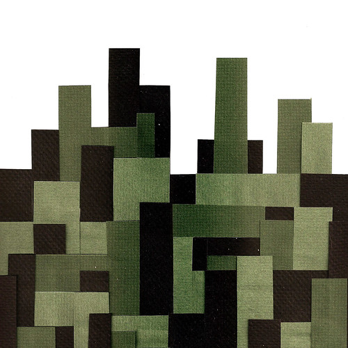
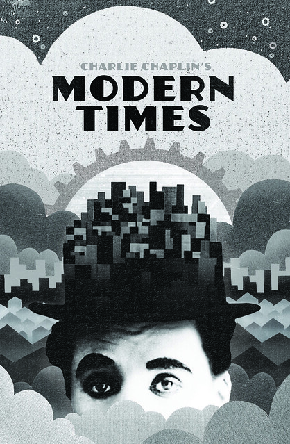
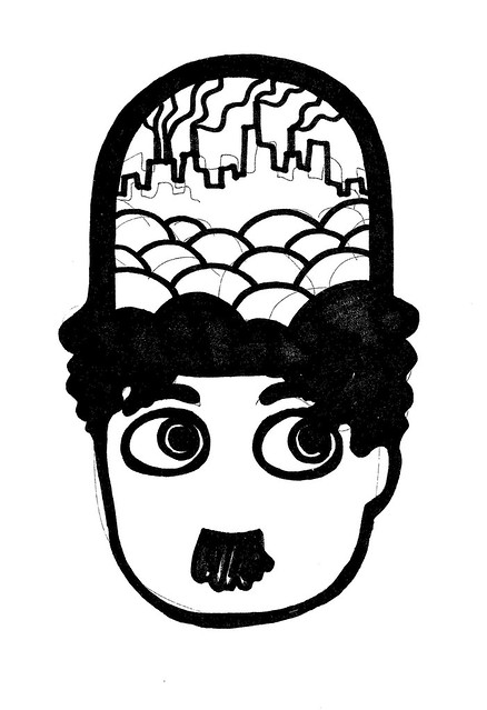
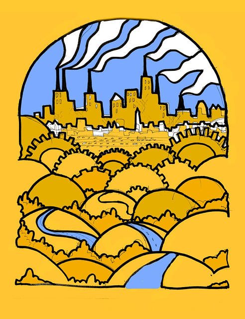
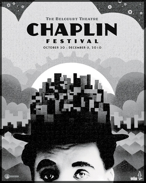
I knew that it was going to be important to represent the modern city as a major character in the artwork, but also that I needed to feature Chaplin himself. The above cartoon of Chaplin's hat becoming a kind of cityscape / landscape had some potential, and it would come up again later. The yellow drawing above touched on a vision I had in my mind of a massive cartoon landscape that showed both the looming industrial city with its giant buildings and gears as well as the natural landscape, with the gears and the hills blending together, and in a more polished version of this concept I imagined a great volume of tiny details-- people, cars, shops, trains, houses, trees, a whole miniature modern world contrasting the modern city to the open American landscape. These initial sketches and doodles served as a way to explore the themes I wanted to focus on while also providing some graphic and textural templates to work with, like the above paper cityscape which would later end up serving as the template for the entire package.

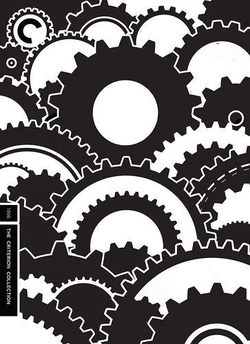
This led to a cover idea that I envisioned as a landscape of gears. The images of Chaplin crawling around and through these massive factory gears are some of the most well-known in movie iconography, and I was initially hesitant to use the gear imagery just since its so obvious. At the same time, if a good design came of the gears I didn't want to rule them out, as some things are obvious because they have good reason to be. Initially, we considered the possibility of using die-cut holes in a cardboard slipcase, where images of Chaplin would slide through the die-cut openings and reveal different moments and scenes. So I made this unfinished "gearscape" layout with that idea in mind.


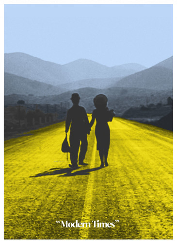
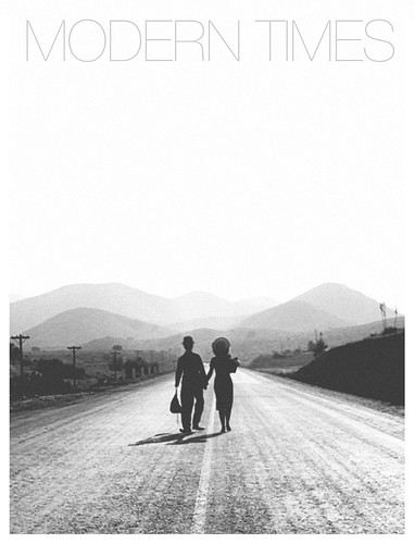
Meanwhile, I had sketched out two other simple ideas that I thought might work for the cover. The first featured the last shot of the film. I hate to spoil it for anyone reading this, and if you don't want to know what that shot is you might stop here, but I also had the thought that if there were ever a last shot to give away in a poster or cover, this would be a good contender... It's just that good. And what I really, really loved about it was that it showed both Chaplin and his wife at the time, Paulette Godard, and the story is ultimately about these two characters, as a couple. I loved that idea, and although it wasn't ultimately represented in the cover, I tried to spread this theme out through the rest of the package and menus later. This image wasn't the ideal choice for the Criterion cover because it didn't really address any of the modern or technological themes of the movie. The image of the couple walking away had also been used in existing posters and we needed to create some new iconography for the film.


Another doodle led to this concept of Chaplin's face with mismatched gears for eyes. Here I was really inspired by the Czech and Polish posters I love that used a decisively abstract style and didn't necessarily concern themselves with matching the look or story of the film they represented. The black rounded border and some of my type experiments were conceived as a direct homage to these kinds of posters.


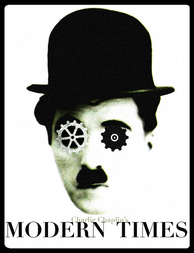
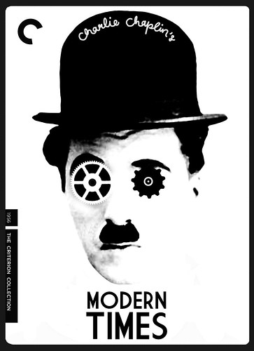
Criterion really responded to this design, and we realized it actually worked quite well thematically as well as graphically, in that the movie is about Chaplin's Tramp becoming a part of the industrial machine and going kinda crazy in the process. From here I added the branding and set out to find the perfect typeface to use, at which point our friend F. Ron Miller helped out by suggesting some typefaces from the period. Throughout the process, we also refined the actual image of Charlie's face to make it slightly less abstract than my original concept. I must have tried about 50 different type and layout variations, but we finally found one that felt just right.


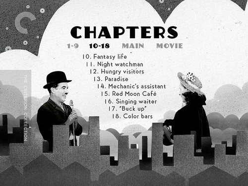
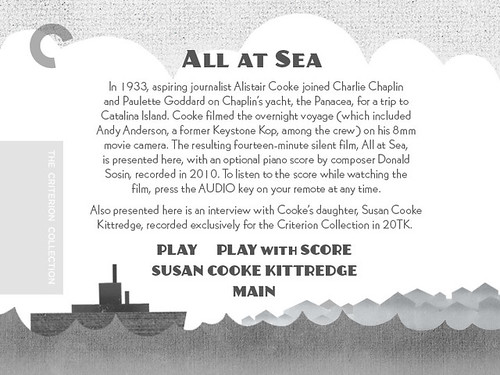
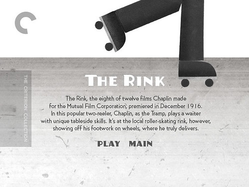
From there it was time to start on the menus and booklet. While Criterion Blu-ray menus are built around one image or video with an overlaid interactive menu, their DVDs use multiple menus for each special feature, chapter menu, etc. I had a lot of fun working with some cut-out paper illustrations and integrating them with images from the film. Here I had the opportunity to play with all of Chaplin's personas, sequences and locations within the movie, aside from the industrial gear & factory imagery everyone associates with it, and really create my own playful visual world. I applied this style to the booklet as well, the cover of which used my earlier hat-city idea and became a screenprint for the Belcourt's Chaplin Festival. Here are some selected images from the menu and booklet art:


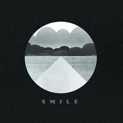
I came up with the above image as an homage to that last shot of the film, "SMILE" being the theme song of that section and the song that closes the film. This image, without the text, became the back cover of the booklet.

It was a tremendous honor to work on this release and once again I fell in love with this movie while working on the package. Sifting through hundreds of publicity stills and behind-the-scenes photos from the Chaplin Archives was as wonderful a treat as any movie lover could hope for, and I hope that all the Chaplin fans out there enjoy seeing some of those great images in the booklet and supplements. Janus Films is touring the new Chaplin prints around the country right now and I've been surprised how many people I know have admitted they've never even sat down and watched a Charlie Chaplin movie all the way through. If any are playing near you, check them out and get ready to be moved and entertained. At home, you can enjoy Criterion's MODERN TIMES Blu-ray and DVD, for sale now. Thanks again to Sarah Habibi, Abbey Lustgarden and everyone else at Criterion for this opportunity.

11.15.2010

WILLIAM TYLER - BEHOLD THE SPIRIT


Coming November 23rd on LP and CD from Tompkins Square: William Tyler's Behold the Spirit. The above album cover photography is by Mike Vallera, and I had the honor of doing the overall layout and design for my dear friend William. This is his first record released under his own name (his last full-length was released as The Paper Hats) and as you would expect from any musical endeavor by Mr. Tyler (Lambchop, The Silver Jews, Kort) it is an essential title for your music library. Beautiful instrumental, guitar-centric compositions that you can hear for yourself for a limited time courtesy of NPR at this link. I'm so happy to be even marginally involved in the release of this wonderful record, a perfect soundtrack for the changing of the seasons and the coming winter. Check it out and support your local indie record store by picking up a copy. Enjoy!

11.14.2010

THE KING'S SPEECH


This is stupid, but after all the making fun of the official poster for THE KING'S SPEECH-- one of this year's Oscar-bait dramadies about Britain's King George VI (Colin Firth) and his speech therapist-- I decided to take a few minutes and give it the Polish poster treatment for fun. It's crap and it's rough (King George VI mashed with period-era microphone), but I wanted to see if a completely abstract, tonally inaccurate design could make for just as good a poster as the old standby floating-head-montage poster that we were treated to with this one. I don't really know the answer, but it was a fun 30-minute experiment!

11.06.2010

BEN FOLDS TOUR POSTER


I just left Nashville for a short 3-week tour playing with Ben Folds. Before I left I had the opportunity to design this tour poster for Ben, which will be available at all the shows. It may be for sale online too in which case I'll update this with a link. If you're nearby for any of these shows come check it out and say hi!

10.30.2010

SATURDAY EVENING POSTER


Mondo Cane, 1964, by Zamecznik Wojciech.

MovieGoods.com is selling a $9.99 reproduction of this, but I'm not sure of the quality. Has anyone ever ordered a $9.99 11x17 reproduction from them?

10.27.2010

CHAPLIN PRINT


This 18x24" 2-color screenprint will be available at Nashville's Belcourt Theatre from October 30th thru December 5th or while supplies last. I need to thank the folks at Criterion and Janus Films, as this doubles as a teaser for some of the package art for the upcoming MODERN TIMES DVD and Blu-ray. If you're in Nashville, make sure to check out these brand new prints of these Chaplin classics -- visit the Belcourt's site for the full schedule!

10.25.2010

THE STORY OF HOUSE


A little over a year ago, Nashville's historic Belcourt Theatre treated a virgin midnight movie audience to the craziest movie they'd ever seen: Nobuhiko Obayashi's HOUSE. James Cathcart, a Belcourt staff member who was an important advocate in getting the film booked, had been hyping the movie up to me, and the Belcourt suggested I try designing a poster for it to sell at the screenings. I used the first idea that came to me after watching a screener of the film-- Blanche the cat's psycho-screaming mug-- and adapted it to stand alone as a symbol of the uncanny and over-the-top assault that our midnight movie audience was in for. One year, many more midnight screenings, and a nationwide theatrical tour later, HOUSE has arrived on DVD and Blu-ray, courtesy of Janus Films and the Criterion Collection.


Just after the Belcourt's hugely successful screenings, I came up with a game plan to try to impress the folks at Criterion (and encourage them to release the film) by designing 25 different HOUSE dvd covers. I didn't make it far with this plan (and thankfully it worked out), but I did have a little fun playing around with other ideas inspired by the film, like the above series of alternate posters as magazine covers. I also wanted to give Gorgeous, the film's protagonist, her own poster that matched the original and suggested a different tone, so I created this idea which ultimately ended up in a different form on the booklet cover:


Limited edition screenprints for the Belcourt's encore run of House,
in hot pink, electric blue and sour watermelon.

Getting the email from Janus Films that they wanted to use my poster for the nationwide tour of HOUSE was a dream come true. We worked out the upscaled design (I had designed the original Belcourt poster at only 12 x 18" and we we needed 27 x 40"), changed the text and the posters started going out with the prints. I immediately suggested the idea of doing a t-shirt too, just the cat face, which Eric Skillman put together for me. Months later, decals followed; Blanche had somehow become a miniature cult celebrity of her own. In those months, word of mouth was only getting stronger about this indescribably insane film, and Janus' newly-struck 35mm prints were a hot commodity. Somewhere along the line, a photo arrived in my inbox of Obayashi himself autographing one of the original Belcourt HOUSE posters. Marc Walkow, a mutual friend with Obayashi and Criterion and a producer on the DVD/BD release, kindly arranged for that poster to ultimately end up back in Nashville and it's now one of my most cherished possessions. If the story of HOUSE had ended there, it would have already been too good to be true.


When Criterion decided to induct Janus' Halloween goldmine into the pantheon of the collection, the cover had already been designed, but I was given the opportunity to have some fun with the rest of the package. I relished this chance to highlight the film's many, many gorgeous images that really don't get acknowledged often in reactions to HOUSE; for it is truly a beautiful film. I wanted to avoid any of the obvious images that get burned into your brain after watching HOUSE, and instead feature some less obvious (though nonetheless iconic) images that I've become so attached to as a massive fan of this film. With this approach I also didn't really have to worry about ruining any of the movie's best scares. There was plenty of great imagery to go around.


I also wanted to reframe the movie from the point of view of its characters-- specifically Auntie and Gorgeous-- and celebrate the great archetypal power of this story as Chuck Stephens (another Nashvillian on the HOUSE team) touches upon in his essay "The Housemaidens," contained in the booklet: "A coming-of-age story about a clique of teenage schoolgirls who will never grow old and a demon spirit in the guise of a spinster who was never young..." With a movie like HOUSE it's easy for reviewers and fans to harp on the genre elements and the film's overall craziness, but I've always felt that no one talks enough about how simply beautiful the film is, in both its aesthetic and its story. My approach to the booklet and overall package design for HOUSE was to counter that craziness (which the cover and poster, I think, do a decent enough job conveying on their own) with a tribute to HOUSE's beauty. I like to think that the package is one that would please this movie's biggest fans and most attentive students; the image on the Blu-ray disc, for example, is one that will probably only be recognizable to fans who have seen the film more than once. I also had fun designing the DVD menus:


What started as just another fun movie poster project became, rather quickly, a personal discovery of one of my favorite films. Seeing HOUSE with new midnight movie audiences, bringing new friends and family members to experience it for the first time, and now sharing it with even more people at home, this movie has grown so very dear to my heart. I'm so honored and grateful to have played even the smallest role in the story of HOUSE's North American release and success, and want to thank Toby, James and everyone else at the Belcourt, Mark Walkow, Sarah Finklea at Janus Films, Sarah Habibi at Criterion for getting in touch and really making my wildest dreams come true, and to everyone who was at all involved in bringing HOUSE to a whole new audiences in the United States this past year.

HOUSE is out today on Blu-ray and DVD from Criterion. Buy it, Netflix it, watch it, share it, tell everyone you know about it. Your life as a mortal moviegoer is about to change forever!